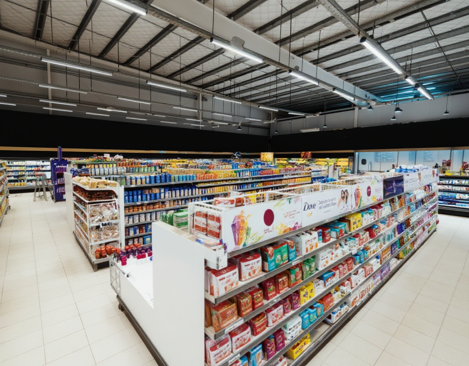
Designing for the 3-Second Rule
February 17, 2026The 3 Mistakes That Kill Packaging at Shelf
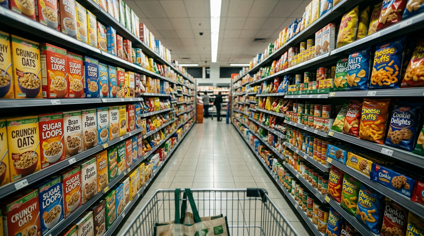
Most purchase decisions happen in seconds. Here are the three packaging mistakes that make products invisible on shelf.
The 3 Mistakes That Kill Packaging at Shelf
Your packaging won a design award.
It looks stunning on your website.
Your team loves it.
Here’s the uncomfortable truth: about 70% of purchase decisions still happen at the physical shelf. And you’ve got roughly the same amount of time as a TikTok swipe—3 to 5 seconds—to win the shopper’s scan before they move on.
Spoiler alert: they’re not reading your brand manifesto. They’re barely reading anything. In most cases, the final decision is made using only what’s visible on the front of the package.
This isn’t about aesthetics. It’s about survival in a visual battlefield where fluorescent lighting, crowded shelves, and competitive chaos decide whether your product gets picked—or passed.
At Ideera, we’ve designed packaging systems for brands across the U.S., Europe, and Asia. Supplements, beverages, skincare, food—you name it. And the same rule keeps showing up: if the package doesn’t win the first scan, the product rarely gets a second chance.
After designing hundreds of retail packages—and watching many beautiful ones flop harder than a reality TV spin-off—the same three mistakes appear again and again.
Mistake 1: Designing for Zoom, Not Distance
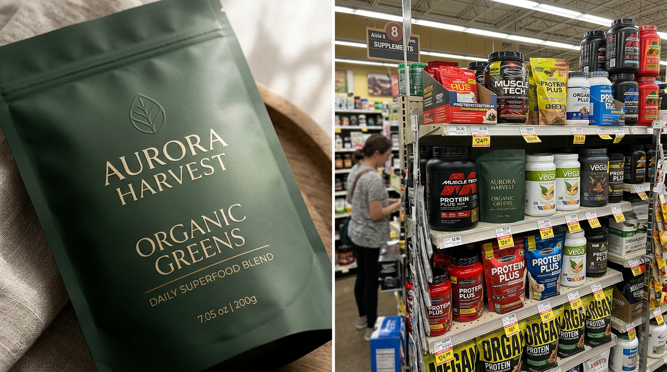
You designed for a 27-inch monitor. Your shopper sees your package from 8 to 10 feet away under harsh store lighting, squeezed between dozens of competitors.
The “Instagram detail”—the subtle texture, the elegant script font, the nuanced gradient—collapses into visual noise at retail distance. What reads as “refined” on screen often reads as “invisible” on shelf.
Walk through almost any supplement aisle and you’ll see it immediately. Elegant minimalist packaging disappears between aggressive competitors using high-contrast color blocks and oversized typography. The quiet design may win awards online. The louder one often wins the sale.
The fix:
Test your packaging from 10 feet away in poor lighting. If the shopper cannot immediately identify brand and category, the design is not shelf-ready.
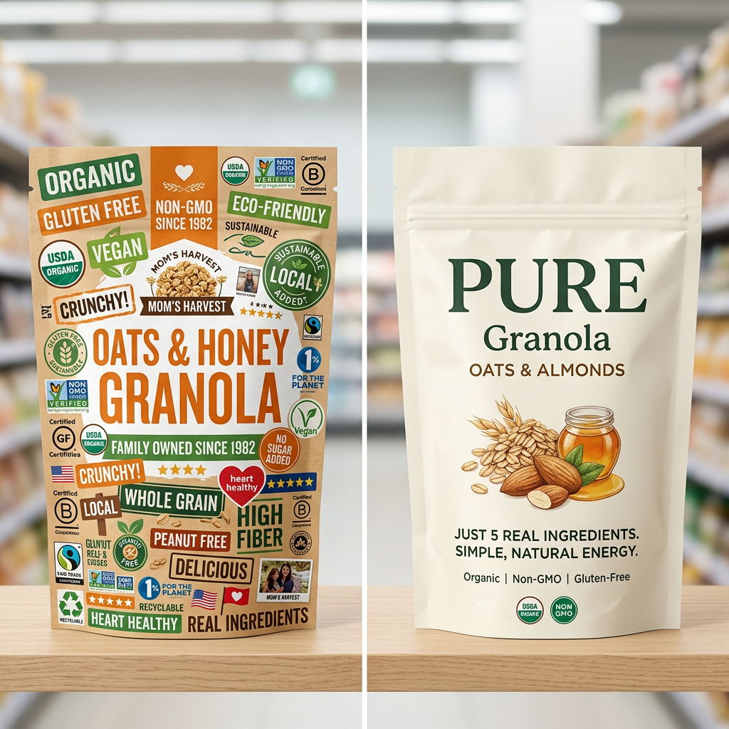
Mistake 2: The Message Buffet
Non-GMO. Organic. Gluten-free. Sustainable packaging. Family-owned. Locally sourced.
Each claim feels essential to the brand. Together, they create cognitive overload.
When a package tries to communicate six messages at once, the shopper’s brain does what humans always do under overload: it skips the decision and keeps moving.
In retail environments, the brain looks for two things first:
-
What is this product?
-
Why should I care?
If the answer isn’t immediate, the shopper moves to the next product.
The fix:
Choose one primary message and make it dominant. Hierarchy is not about everything the brand wants to say. It’s about what the shopper can actually process in three seconds.
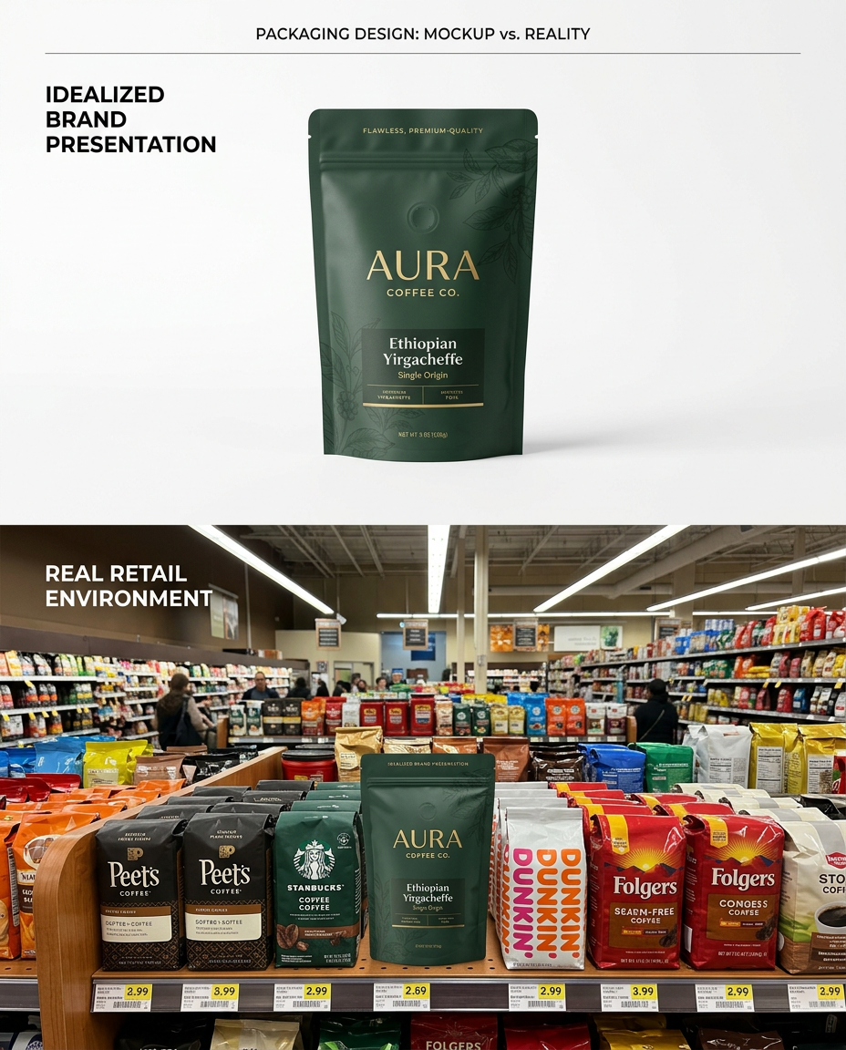
Mistake 3: Designing in Isolation
Your packaging looks heroic on a white background.
But shelves are not white.
They are chaotic environments filled with competing colors, typography, and claims. What feels balanced in a design presentation can completely disappear in real retail context.
This is where pattern disruption becomes critical. Research in retail packaging consistently shows that products breaking category color patterns can dramatically increase shopper “stop-and-hold” time—especially for new brands.
If the category is dominated by white and green, blending in may feel safe. But it often makes your product invisible.
The fix:
Always test packaging in competitive context. Place it next to real competitors, photograph it on shelf, or simulate the aisle digitally. If the product disappears in that environment, the design has failed—no matter how beautiful it looks in isolation.
The 3-Second Framework
Before finalizing any packaging design, run this quick test:
1. 10-Foot Clarity
Can shoppers identify the brand and category from distance?
2. Single Focal Point
Is there one clear reason to buy?
3. Competitive Contrast
Does the design stand out within the category environment?
If any of these fail, the package is not ready for retail.
Packaging isn’t art hanging on a wall. It’s an interface between your product and a distracted human making rapid decisions in a crowded environment.
Design for the scan.
Win the shelf.
Which mistake is your packaging making?
Drop a comment—I’ll give you a quick 10-second shelf audit.