
Pro Modern Icon Set
November 4, 2015
DÉRMA+X
November 4, 2015
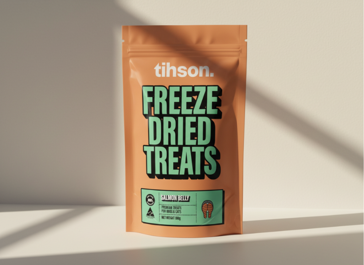
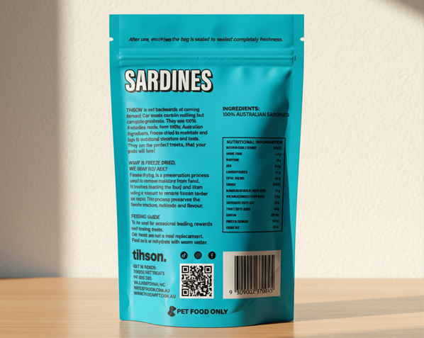
Tihson required a packaging system that could break through a crowded pet aisle dominated by earthy tones and overused rustic cues. The objective was to create immediate shelf visibility while maintaining premium clarity and SKU differentiation. The solution focused on strong typographic hierarchy, controlled color coding, and modular label architecture.


Selected product's images

Chicken Necks – High Protein Single Ingredient

Salmon Belly – Omega-Rich Premium Cut

Diced Lamb Hearts – Iron-Dense Training Treat
Packaging System Overview
Morbi erat nunc, bibendum ut gravida ut
Cum sociis natoque penatibus

Nulla pellentesque cursus dolor at

Packaging Strategy
Retail Behavior
Tihson was designed to compete visually in crowded retail and online environments.
The objective was immediate readability from a distance, strong vertical typography, and colour blocking that instantly separates SKUs on the shelf.
Bold stacking of “FREEZE DRIED TREATS” creates a billboard effect, while simplified ingredient labels improve scanning speed in pet store environments.
System Architecture
Rather than designing one pouch, we built a scalable visual system.
Each SKU follows a controlled structure: fixed typography hierarchy, consistent badge placement, and a modular lower label that adapts by protein source.
Colourways were engineered to avoid shelf confusion while still forming a cohesive brand block when merchandised together.
Commercial Outcome
The final system balances playfulness with authority.
Large typography builds trust through clarity, while bold color contrast increases stop-rate in physical retail and thumbnail visibility in e-commerce.
The result is packaging that performs across formats — from pet boutique shelves to online marketplaces — without redesigning the core structure.