

Supplemented.co.uk
November 4, 2015
Designing a wellness product system rooted in belief, trust, and alternative medicine.
Indigo Naturals was built from a personal belief in alternative medicine and the need for honest, approachable wellness products.
Our role was to design the products themselves as a coherent system — shaping how they are understood, trusted, and used in everyday life.
This project focused on translating belief into form: calm, clarity, and credibility across every physical product.
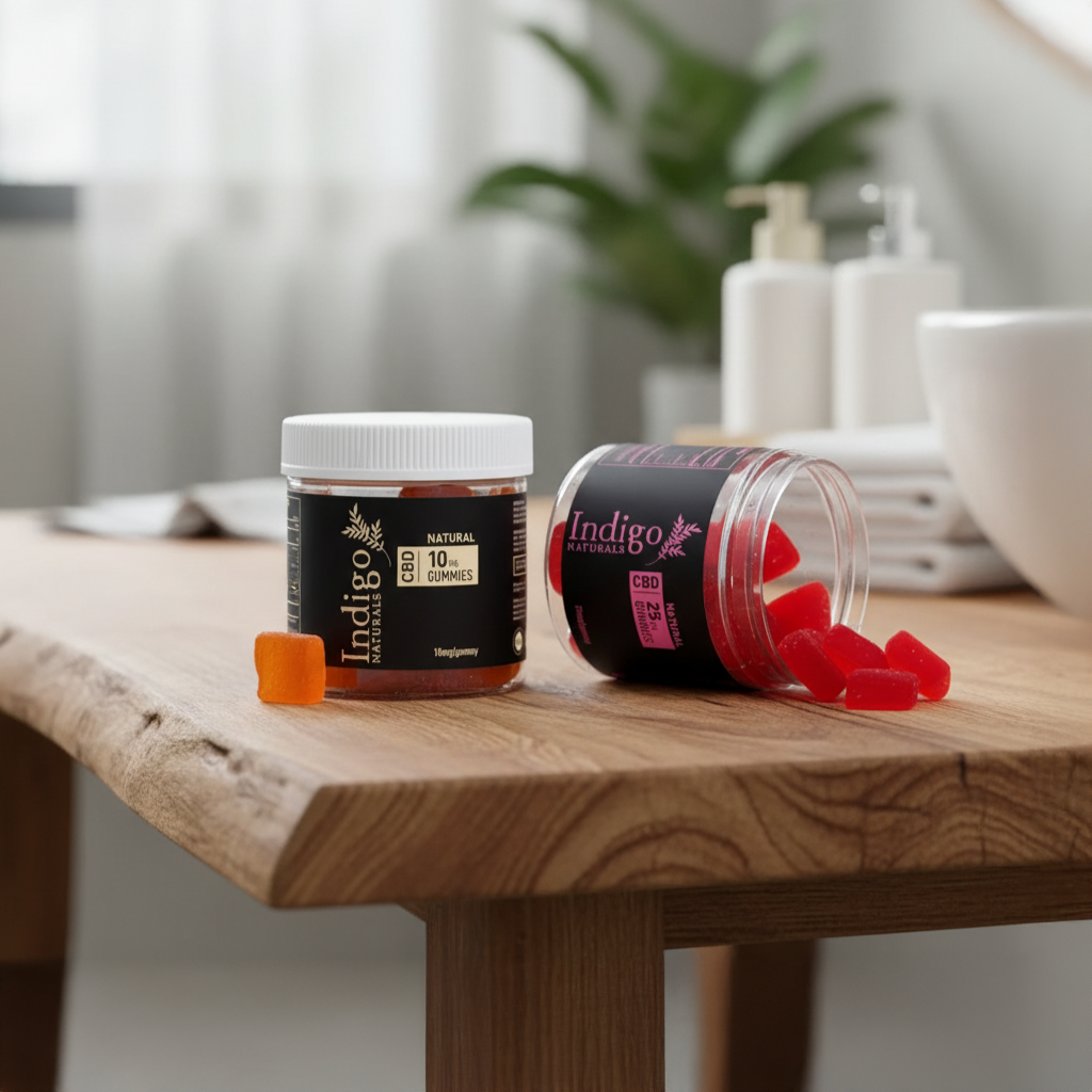

Products we designed. Products people chose and trusted.
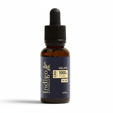
Designed as a clear, approachable entry point into alternative wellness. Nam vulputate lacinia

Designed for experienced users seeking consistency, potency, and trust.
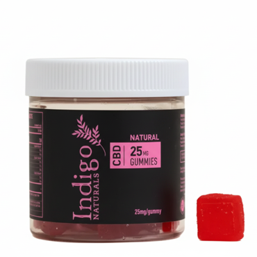
Designed as an accessible, everyday format without sacrificing clarity or credibility.
The product system

Each product was designed to communicate purpose, dosage, and use clearly — using consistent hierarchy, spacing, and material treatment across formats. This system-first approach allows the products to scale naturally while remaining calm, credible, and easy to understand in real-world use.

The visual identity exists to support the products — not to compete with them.
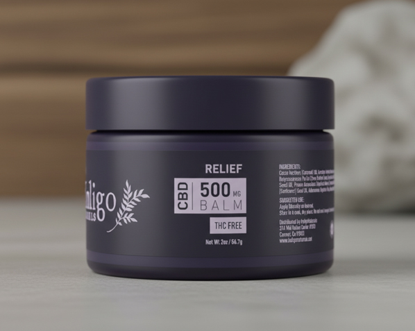
Rather than starting with a logo or visual signature, the Indigo Naturals project began with defining a product logic.

Design principles
Experience
Indigo Naturals began with lived experience, not a market opportunity. The founders’ journey through hormonal imbalance, recovery, and alternative medicine shaped how they approached wellness — with caution, curiosity, and a strong resistance to exaggeration.
Rather than seeking quick solutions, they looked for products that could support everyday life quietly and consistently. This perspective informed the foundation of the project: wellness as a personal process, not a promise.
That experience became the reference point for every design decision that followed.
Translation
The design challenge was to translate this personal experience into physical products without turning it into marketing language. The focus shifted from expression to interpretation — understanding how belief, doubt, and trust manifest at the moment someone encounters a product.
Design decisions prioritized clarity over persuasion, structure over decoration, and consistency over variation. Information hierarchy, spacing, tone, and material choices were treated as tools to reduce anxiety and support understanding.
The role of design was not to convince, but to make sense.
Design outcome
The resulting products behave calmly in the real world. They are easy to read, consistent across formats, and intentional in how they present dosage, purpose, and use. Each product feels part of a coherent system rather than a standalone object competing for attention.
This approach allows the products to earn trust over time, through repeated use and familiarity. The design does not ask for belief — it supports it.