

DÉRMA+X
November 4, 2015
Indigo Naturals
November 4, 2015Designing a supplement system built to be understood, trusted, and used every day.

Designed for clear handling, legibility, and everyday use.
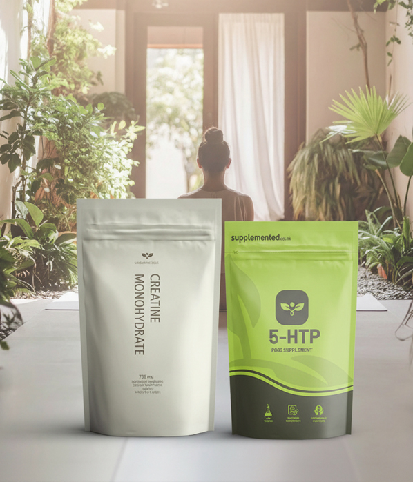
Parallel design directions developed for distinct user groups.

Visual language is tested across different lifestyles and routines.
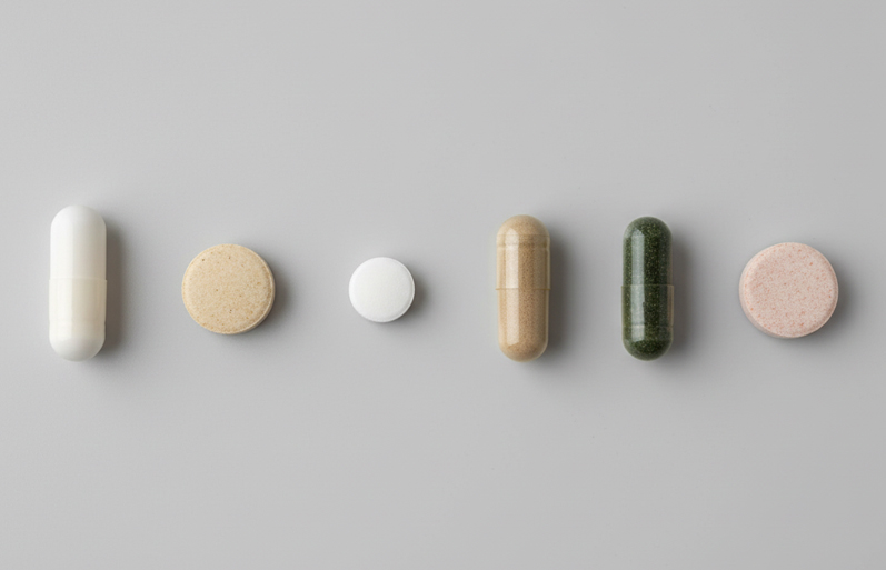
Form, color, and dosage were designed to support user perception and comfort.

A performance-driven direction shaped by ingredient meaning and user response.
Pill Design Logic
Pill design was treated as part of the overall product experience, where form, color, and finish were intentionally considered to support perception, comfort, and long-term daily use.

Nature-Derived Reference
This pill was designed using color cues inspired by its primary natural source, reinforcing the connection between ingredient origin and user perception.
The goal was to translate complex nutritional value into an immediately understandable visual signal, helping users feel grounded, informed, and confident in daily use.

Perception & Comfort
Color and finish were carefully selected to reduce intimidation often associated with supplements, favoring familiarity and calm over clinical severity.
By aligning visual tone with intended benefit, the pill design supports comfort, trust, and long-term adherence rather than short-term impact.
Video session
Designing supplements requires more than visual clarity — it demands awareness of safety, dosage responsibility, and how information is communicated to users.
This project was approached with a strong emphasis on transparency, ensuring that visual design supports informed decision-making rather than overstated promises.
While the video shown here is a temporary reference, it reflects the broader context in which supplement products exist — where trust, education, and responsible presentation are critical to long-term use and credibility.
Design approach
Starting point
This project began from scratch in close collaboration with David, the founder of Supplemented.co.uk.
Rather than inheriting an existing system, the work started with defining how supplements should be presented, understood, and used by real people on a daily basis.
Early discussions focused on clarity, responsibility, and avoiding exaggerated visual language common in the category.
The goal was to build a product system that felt grounded, trustworthy, and easy to navigate from the very first interaction.
Package & system design
Packaging was designed as a structured system rather than isolated products.
Information hierarchy, color logic, and layout rules were carefully defined to ensure consistency across a growing range of supplements.
Multiple design directions were explored to address different user mindsets, allowing the system to evolve through real-world feedback.
Over time, the validated direction became the foundation for a scalable, repeatable packaging system that supports both retail and online environments.
Pill design considerations
Pill design was treated as an integral part of the product experience.
Form, size, color, and finish were intentionally designed to support user comfort, familiarity, and perception, rather than being dictated solely by formulation.
By aligning pill appearance with the meaning of the ingredients and the intended use, the design reduces intimidation and supports long-term adherence.
These decisions reflect the same principles applied to the packaging — clarity, restraint, and respect for the user.